
Client: Heat Transfer Products Group
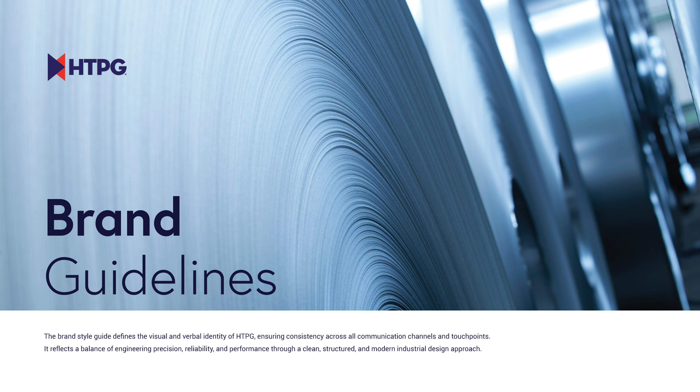
HTPG makes commercial refrigeration equipment for supermarkets, warehouses, foodservice, and OEMs, sold through four established brands. The brand had grown one asset at a time and looked dated next to the products it sold. I led a full rebuild of the identity system and wrote the guidelines that now govern it.
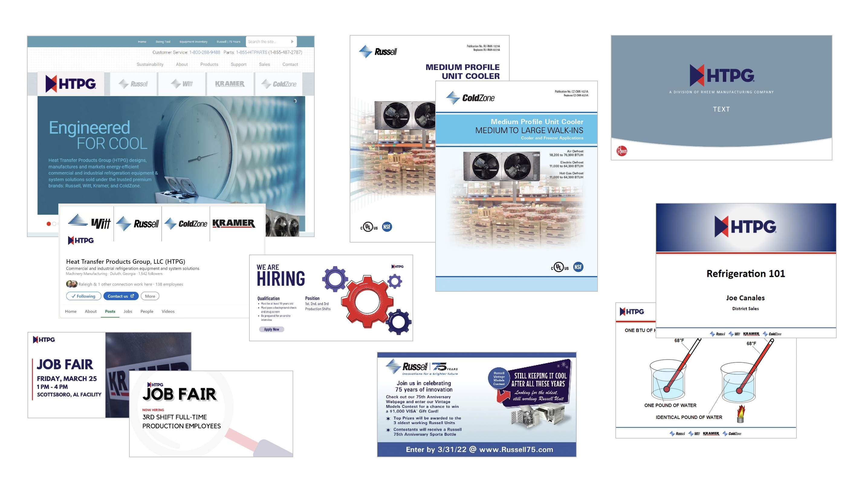
CHALLENGE
Five brands, no shared rules
HTPG and its four product brands each carried years of their own habits. There was no clear answer to how HTPG should relate to Rheem above it or to Russell, Kramer, ColdZone, and Witt below it, so every piece of collateral solved that question differently.
IDEA
Engineered, like the product
Treat the brand the way HTPG treats its equipment: precise, built from defined parts, and designed to last. Anchor it in Rheem's values, give each brand a clear tier and role, and express it all through the line Engineered for Cool.
RESULTS
One system, ready to scale
A modern, unified identity with written rules for every decision that used to be made case by case. Sales, engineering, and partners now work from the same playbook, and new materials come together faster and look like one company.



01
Audit
Gathered existing collateral across HTPG and all four brands to map where logos, color, type, and messaging had drifted apart.
02
Foundation & Architecture
Translated Rheem's mission and four values into four HTPG brand pillars, each with descriptors and proof points in HTPG's own voice.
Defined how the brands relate: the Rheem endorsement, the HTPG Family of Brands lockup, a two-tier lockup limit, and a fixed portfolio order.
03
Identity & Voice
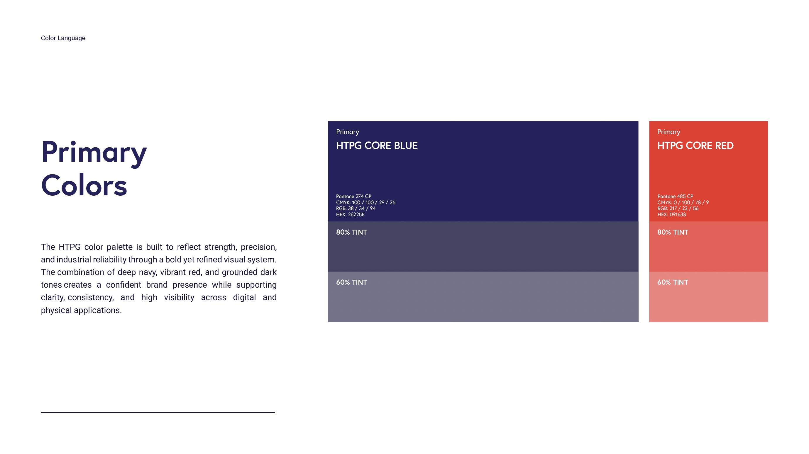
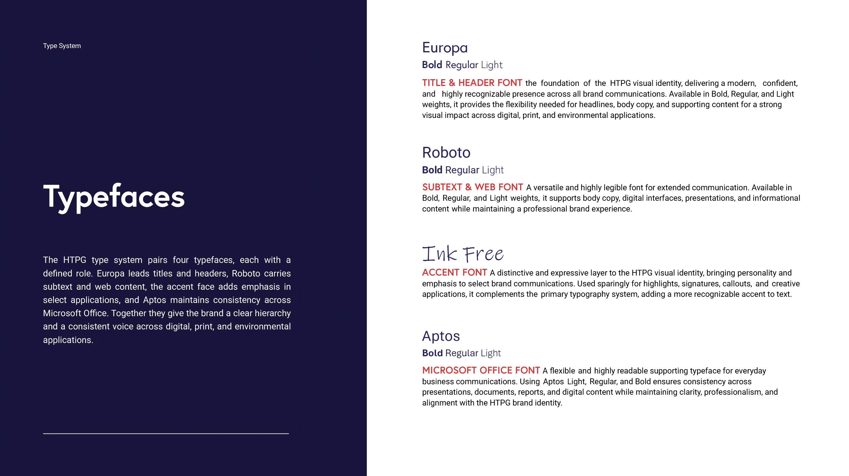
Refined the logo framework and built the core palette, type system, brand patterns, textures, tone, messaging, and photography direction.
Set the tone of voice and a three-word headline rule so every message reads with the same rhythm and confidence.
06
Application
Proved the system on real work, from technical bulletins to signage, and set an approval step through Marketing & Communications.