
01 — Challenge
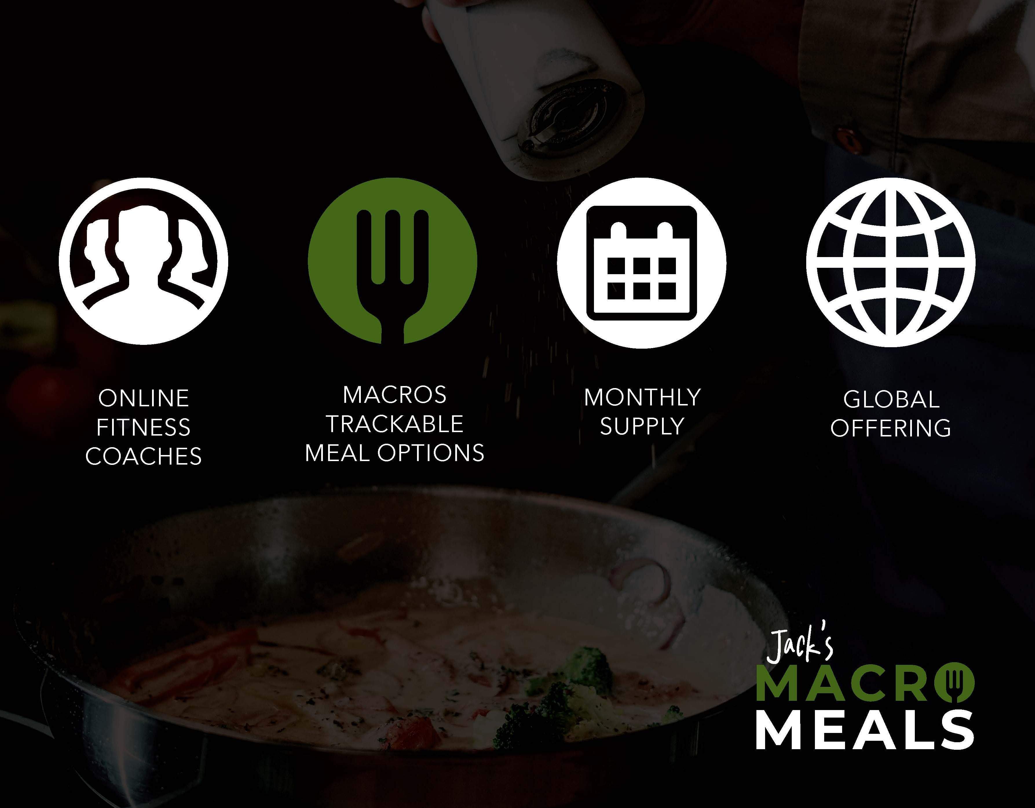
Jack’s Macro Meals was a startup entering the competitive meal-prep and fitness nutrition space with a unique focus on macro-trackable meals for online fitness coaches and their clients. The challenge was to create a brand identity that felt both fitness-driven and approachable — balancing performance, simplicity, and freshness without looking overly clinical or generic. The brand also needed a scalable visual system that could support marketing, social media, packaging, and custom menu/recipe card templates for recurring meal offerings.
02 — Creative Process
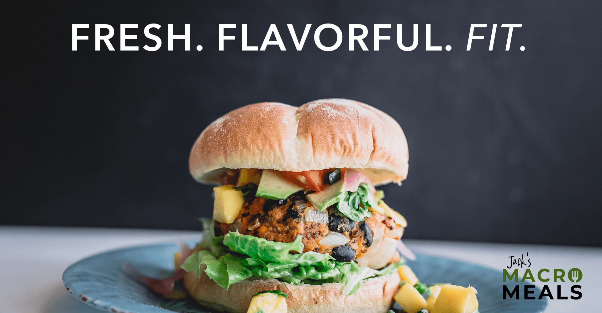
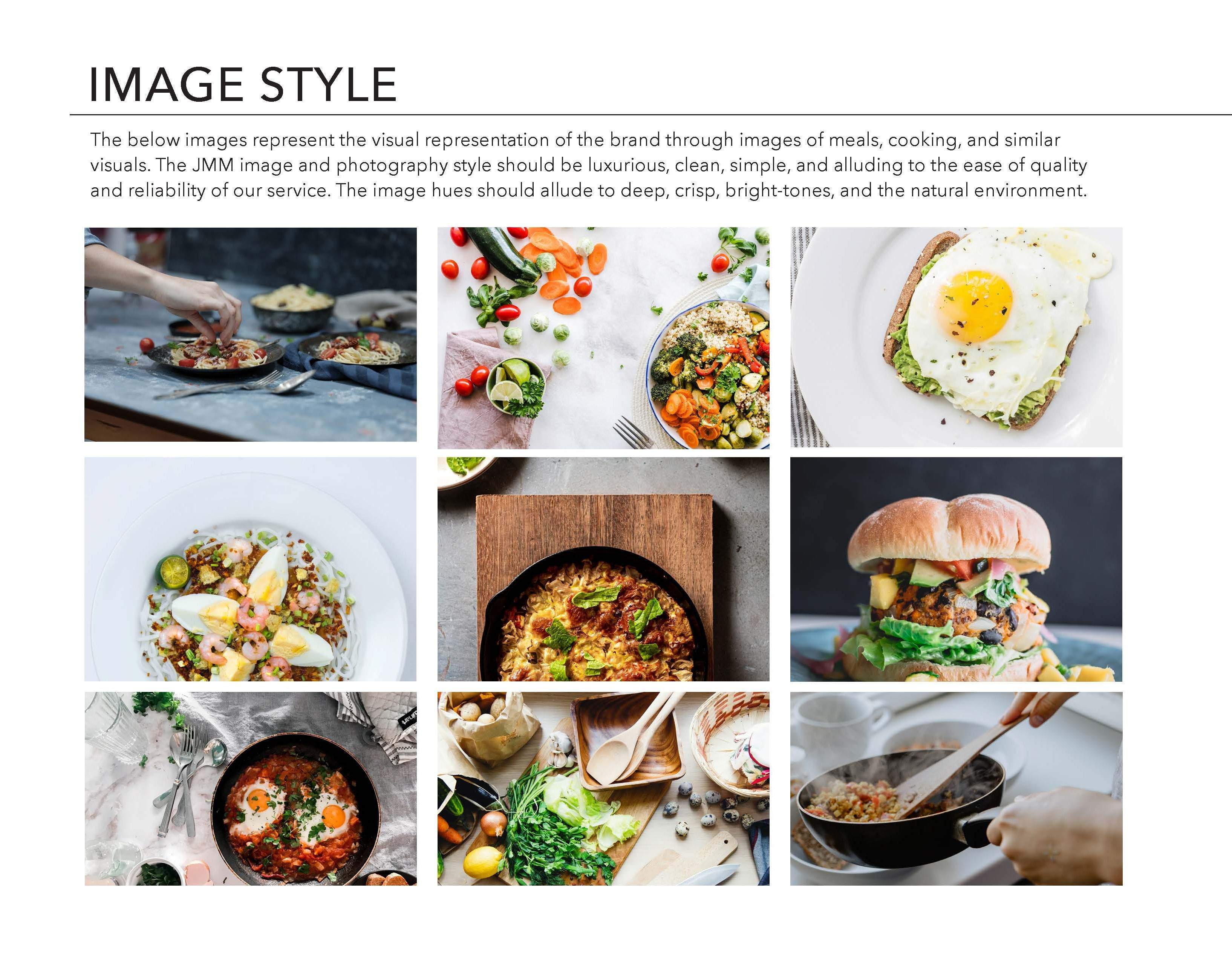
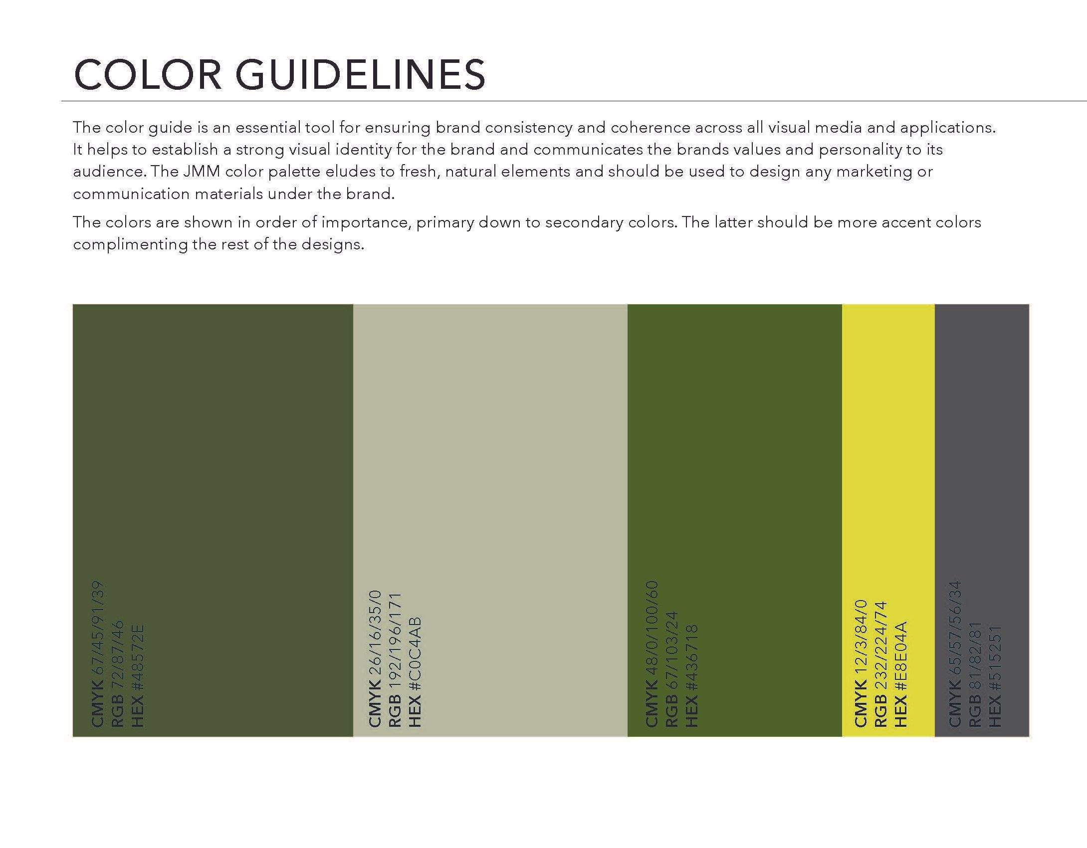
I developed a complete visual identity system centered around the idea that healthy eating should feel simple, measurable, and enjoyable. The brand combined clean typography, earthy greens, fresh food photography, and minimal iconography to communicate freshness, reliability, and transformation.
The fork icon and modern sans-serif typography helped reinforce the connection between nutrition and performance, while the visual language emphasized clean, elevated meal presentation rather than traditional “diet food” aesthetics. I also created a flexible template system for menu and recipe cards, allowing the business to consistently showcase meals, ingredients, and macro information in a visually cohesive and easy-to-digest format across print and digital touchpoints.
03 — Results
The final brand identity positioned Jack’s Macro Meals as a premium yet accessible fitness meal-prep company tailored to coaches and transformation-focused clients. The cohesive brand system included logo development, typography, color palette, photography direction, social media assets, and branded marketing templates that established consistency across all customer touchpoints.
The custom menu and recipe card templates gave the startup a professional, scalable foundation for ongoing content creation and customer engagement, helping communicate meal variety, macro transparency, and brand credibility from launch.